CHRISTINA, EMMA & ROB - 'SHADOWS' FINAL VIDEO from cmdiploma on Vimeo.
Sunday, 21 March 2010
Friday, 19 March 2010
1. In what ways does your media product use, develop or challenge forms and conventions of real media products ? Part one

1. a shot that shows a link between lyrics and/or music and visuals
2. a shot that typifies the way a record company would want their artist to be represented
3. a shot that illustrates how your video uses music genre
4. a shot that shows an intertextual reference
5. a shot that demonstrates your use of camera
6. a shot that demonstrates your use of lighting
7. a shot that demonstrates your use of mise-en-scene
8/9. Two shots which you feel demonstrate something which shows you have watched other music videos
1. The lyric i looked at for this part was 'Im moving on'. so i got the shot of when everyone starts moving fast and emma stays normal speed.
2. For this i got the shot of the band with there instruments, because the record company would want the band to be seen playing there music them selfs.
3. I used this shot for this part because it shows different levels of focus used in allot of indie label videos i have seen.
4. I picked this shot because it relates to Alice in Wonderland, with the Pocket watch.
5. I picked this shot because ti is a moving shot with another moving shot over the top. we used the panning technique to add motion.
6. I used this shot because it shows the lights we used around the back of the band. thus demonstrating our use of lighting.
7. I picked this shot because everything in our shot is framed and supposed to be in the shot.
8/9. I picked this shot because i is a standard mid shot in most videos. i picked shot nine because we have layers shots to create an effect of a ghostly figure i have seen in a music video.
1. In what ways does your media product use, develop or challenge forms and conventions of real media products ? Part two

1. a shot that shows a link between lyrics and/or music and visuals
2. a shot that typifies the way a record company would want their artist to be represented
3. a shot that illustrates how your video uses music genre
4. a shot that shows an intertextual reference
5. a shot that demonstrates your use of camera
6. a shot that demonstrates your use of lighting
7. a shot that demonstrates your use of mise-en-scene
8/9. Two shots which you feel demonstrate something which shows you have watched other music videos
2. a shot that typifies the way a record company would want their artist to be represented
3. a shot that illustrates how your video uses music genre
4. a shot that shows an intertextual reference
5. a shot that demonstrates your use of camera
6. a shot that demonstrates your use of lighting
7. a shot that demonstrates your use of mise-en-scene
8/9. Two shots which you feel demonstrate something which shows you have watched other music videos
1. The lyric in this shot was 'So what if i never hold you, or kiss you lips again' and the shot shows a girl kissing a guy.
2. This shot shows the band playing there own music. which is what they would want to promote.
3. Standard metal music live performance set up showing the band playing.
4. this shot shows a man jumping into hell. the song is about the road to damnation being a easy way out. hence the song being called almost easy.
5. This is a steep shot of the lead singer of the band. this shows that some thought has gone into the camera work and shots.
6. This is a shot of a band playing a live show with extravagant use of lights.
7. This shot show the band in a motel room surrounded by girls. you can tell everything in the shot has been thought about and has a reason for being there.
8/9. i picked these two shots because i feel they have been influenced by such things as the Gorilaz because of the cartoon effect.
2. How effective is the combination of your main product and ancillary texts?

I created this image in photoshop to explain the link between the finished video and the visuals in my digipak. As you can see the video and digipak both have a strong woodland and nature theme through out, with a distinctive link though trees.
We tried to create an Alice in Wonderland theme in our video as you can see in the Grabs from the video. As well as the front cover of my Digipak.
3. What have you learned from your audience feedback?

This is my Wordle Tag cloud fro all my feed back i recived for my finished video.
some feedback i got from one of my teachers was to make the tea party bits black and white because the sped up part of the charicters reminded him of a silent movie.
we had a go with some footagebut i didnt look quite right. for example the gold tea from the pot wasent gold anymore and we wanted it to look surreal.
Most feedback i got was positive things like;
Very good video
Good
Looks professional
But then some negative;
Too Dark
Didnt Get it
Too meany smiles for a sad song.
Taking all of the feedback into count i would have bighted up some parts but overall i am happy with the finished video.
4.How did you use new media technologies in the construction and research, planning and evaluation stages?

Photoshop: This is the software i used to edit photos for my Digipack and Poster.
Google: google is as a search engine i used to do research for the project.
Wordle: i used this to arrange all my feedback in an interesting way.
Flickr: I used this to find pictures to go on my blog and to go onto my moodboards etc.
Itunes: I used this to download Shadows on to my ipod.
Photobucket: I used this to find pictures that related to my idea and to use on my moodboard.
Facebook: I used this to get some feedback on my video.
Youtube: I used this to find influential videos to help me with my project.
Blogger: This was my Blog where i kept all my planning and research.
Myspace: we used this to email Au Revoir Simone so as to get in contact with them.
Vimeo: I uploaded all versions of our music video on to this and this is where we got feedback.
Using all this stuff really helps with all of the project.
Tuesday, 16 March 2010
Finished video!
This is my finished video for shadows.
If i had more time i would of liked to go into more detail in the editing and do a little more with the video. i would of liked to get more shots of things to put in the video, and have a bigger variety or shots.
i have linked my video on face book and asked for feedback. i have had a few replys so fur but nothing major.
Thursday, 11 March 2010
Finished Digipak
This is the finished front and inside of my digipak and poster.
Front and Back
This is the back - front of my Digipak, i made this at home and edited it at college today. I added the four pictures of the characters and put the effect dark strokes on them to give it at shadowy effect.
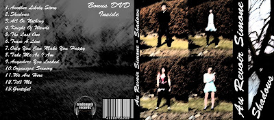

Inside
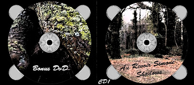
This is the inside of my Digipak containing the CD and DVD. I put the images of trees we took in our group and again used the effect dark strokes to add a shadowy effect.
on the grey parts that represent the CD holder i added the chrome filter to give it the look of plastic.

Poster
For my Poster again i used a picture of a tree we had taken and again added the Dark Strokes filter, but this time i inverted the image to make the poster more eye catching.

I enjoy doing tasks like this involving photoshop, i find them challenging yet fun because i can explore new effects (or stick to the usual Dark Strokes :p) I find photo manipulation quite calming and a interesting thing to do because you can get the same image and make it into something different every time you edit it.
Wednesday, 10 March 2010

Tuesday, 9 March 2010
Today!
Today me and Liam went out to help Max and film for of his music video.
we went to various locations around cambridge and got a few more cutaways and a few more takes of the song.
Filming went well and we got all the setups Max wanted for the morning.
Rough Cut Feedback
This is the feedback my group was given from our rough cut.
- I like the use of shots
- Fading shots together works well
- Great atmosphere and composition
- I like how the background is fast and Emmais normal pace
- The atmosphere fits the song
- Good use of effects e.g. the timelapse + stopmotion
- Good lip syncing, instrument playing, lighting, cards, costume, location and effect
- Great opening shot
- Great shots of cards
- Feels like a music video already - set the scene with close up's very effective. First chours made me smile
- Varitey of camera angles/cut aways
- Scene set up well
- I like the night theme with the flashing lights and the cards spinning round
- Good performance and locations
- The opening is amazing: effects, shots, lip syncing, mise en scene, costume (there were ticks by all of these)
- Love the tea party sped up scene
- The tree with lights look great
- I like how the footage blurs then focuses
The improvements/weaknesses received were fairly similar. Most people thought some of the band performance was too dark and the contrast of this with the tea party being so bright made the video lose flow in some places
Other comments included:
- Too Dark in some places
The improvements/weaknesses received were fairly similar. Most people thought some of the band performance was too dark and the contrast of this with the tea party being so bright made the video lose flow in some places
Other comments included:
- Too Dark in some places
- Less movement from singer - needs to be more focused on camera(there's not much we can do about this unless we re-shoot, which we don't have time for)
- Lip sync is off in some points or Emma giggles (we're going to cover up the giggling with cut aways)
- Should add more cut aways
- Try out effects on certain parts or brighten them up
- Need to draw attenetion to the speed up thing
- In some bits the performer isnt convincing
Rough Cut
This is the Rough Cut for my groups video.
we made this on friday and exported it ready for feedback on monday.
Friday, 5 March 2010

Thursday, 4 March 2010
Feedback
The Feedback
- i like the effect on the trees, in contrast with the still text. not sure about the picture of people, it looks a bit like it's just plonked there. typography seems out of place. i like the black around the CD.
- I really like the effect used on the images, and find the front image very interesting and is alike with the actual bank, however the font is a bit boring, and i'm not too clear whitch is the front or back.
- Good use of 'Opie' effect. Good use of typography. Nice Photos.
My Thoughts
I agree with most of the feed back i was given for example, People liked the effect i put on the trees which i felt good about because i feel the work i did on the trees reflects the shadow feel on the song.
Not many people like my use of font with i agree with, i could put more thought into it.
Im happy most people liked the image of the band i created, i think the bark background refects the shadows.
Possible changes
Text, a bit think im going to have to put some thought into as most people said it really didn't work.
i would like to find a way to make the band image fit better with the rest of the digipak, some people said it looked out of place.
Subscribe to:
Posts (Atom)